Branding
Die Gedanken hinter meinem Branding
Zuerst einmal: Ich hoffe, ich muss nicht so bald wieder meine eigene Kundin sein. 😂 Ich bin eine absolute Perfektionistin – etwas, das mir als Ausdruck einer Jungfrau-Platzierung nachgesagt wurde. Jedenfalls… nach fast einem Jahr Arbeit an meinem persönlichen Rebranding kann ich endlich sagen: Ich liebe es. Zwei unterschiedliche Businesses unter einem Dach zusammenzuführen, war keine leichte Aufgabe, aber es gibt ein Bindeglied und das bin ich. Hier möchte ich die Ideen und Visuals hinter meiner Marke teilen:
Die Farben
Mit den Farben wollte ich sowohl helle als auch dunkle Töne einbeziehen, um das gesamte Spektrum des Lebens darzustellen. Wir haben helle Tage, aber wir können uns auch an dunklen Orten wiederfinden – je nachdem, was wir erleben. Diese Dualität ist es, die das Leben… Leben sein lässt. Wir hätten das Licht nicht ohne die Dunkelheit – und umgekehrt. Mein Branding soll eine sanfte Erinnerung daran sein, dass beide Seiten Teil unserer Welt sind. Und natürlich bis das Helle bei mir überwiegend. Eine Erinnerung daran, das wir es immer selbst in der Hand haben, was wir beleuchten wollen.
Der Ozean & die Luft
In meiner Arbeit – sei es im Branding oder mit AIRE – tauche ich tief ein. Tief ins Thema, mit dem Ziel, es in all seinen Farben zum Leben zu erwecken. Auf der Branding-Seite gehe ich der Person hinter der Marke auf den Grund, stelle wichtige Fragen und lese zwischen den Zeilen. Ich spüre die Energie jedes Projekts und übersetze sie in Farben und visuelle Elemente.
Mit AIRE lade ich meine Klient:innen dazu ein, nach innen zu schauen – in Bereiche, die sie vielleicht lange gemieden haben. Ich möchte, dass sie sich gesehen fühlen, in all ihrer Komplexität, und zugleich neue Horizonte entdecken. Oft bringt dieser Prozess verborgene Aspekte ans Licht und verwandelt sie in etwas Neues und Stärkendes. Wasser ist zudem ein Element, mit dem ich mich immer tief verbunden fühle – ebenso wie mit der Luft, dem Unsichtbaren. Beide sind Teil meiner Marke.
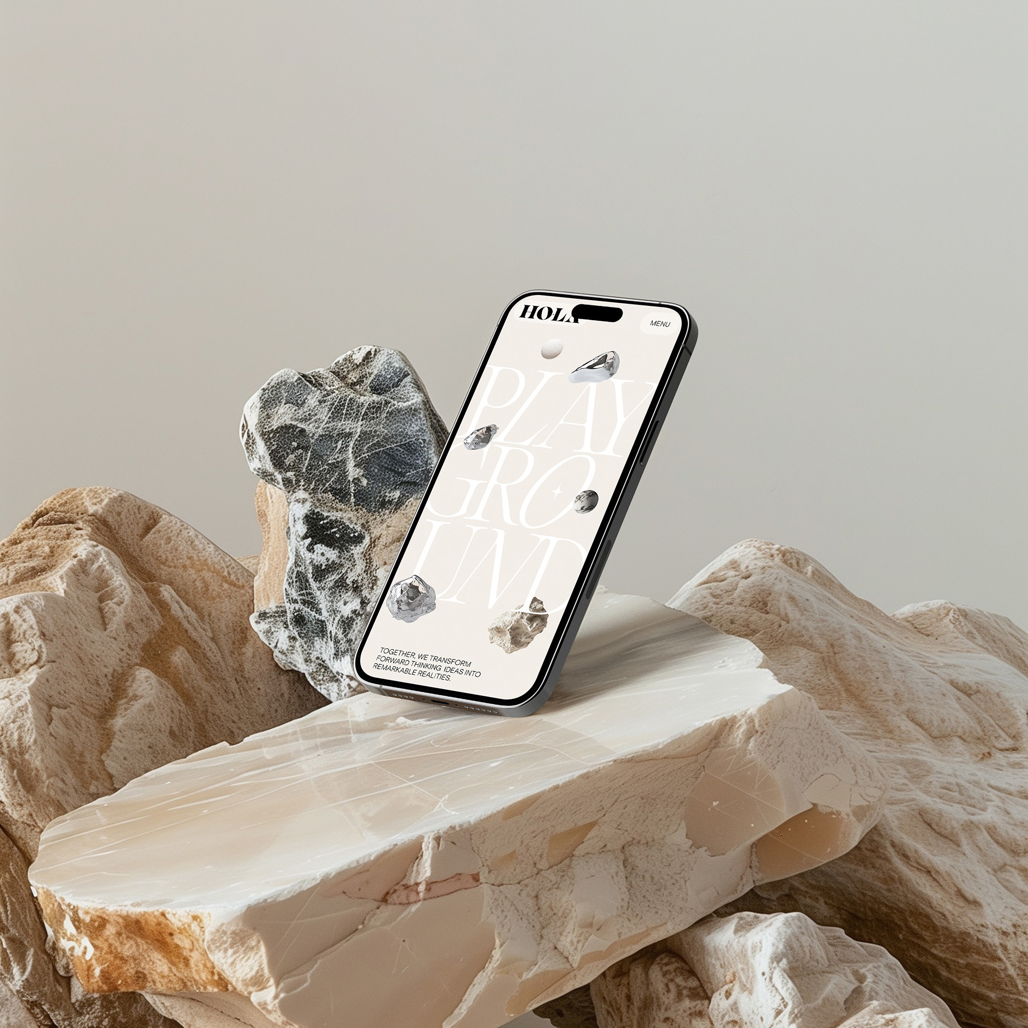
Fiktive Welt
Mit meiner Marke wollte ich ein Design schaffen, das meine Vision vollständig widerspiegelt – so, wie meine Welt aussehen würde, könnte ich sie in einem 3D-Raum bauen. Chrome-Elemente, moderne Linien und minimalistische Formen verbinden sich zu einer klaren und zugleich modernen Aura, die sowohl Klarheit als auch Tiefe ausdrückt.
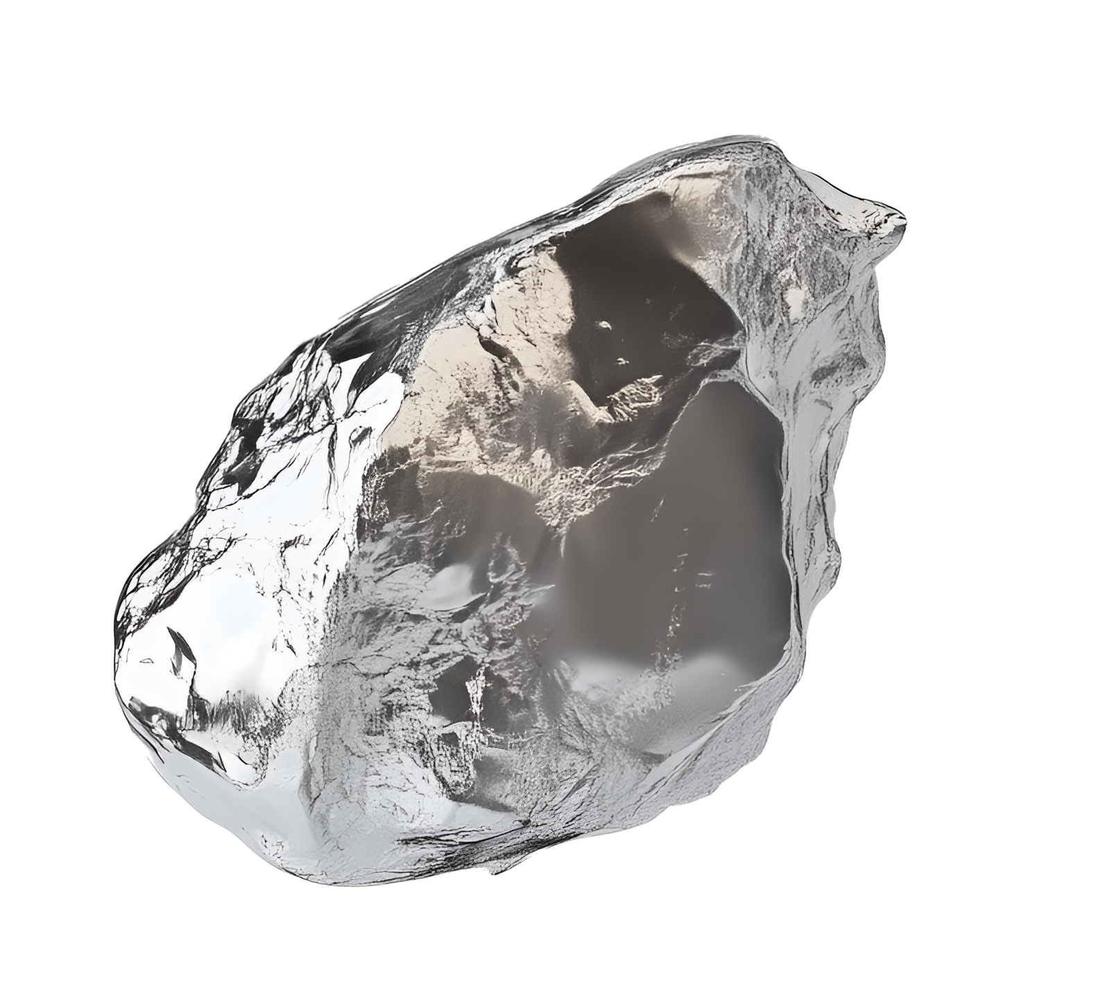
Schwebende Elemente
Ich liebe die abstrakte Idee von schwebenden Steinelementen. Sie erinnern mich an das Universum, in dem Steine mühelos schweben – eine Erinnerung daran, dass alles Energie ist und sich in Bewegung befindet. Und natürlich: Das passt perfekt zu AIRE, was auf Spanisch „Luft“ bedeutet.
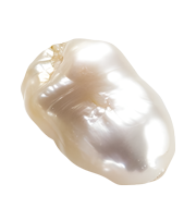
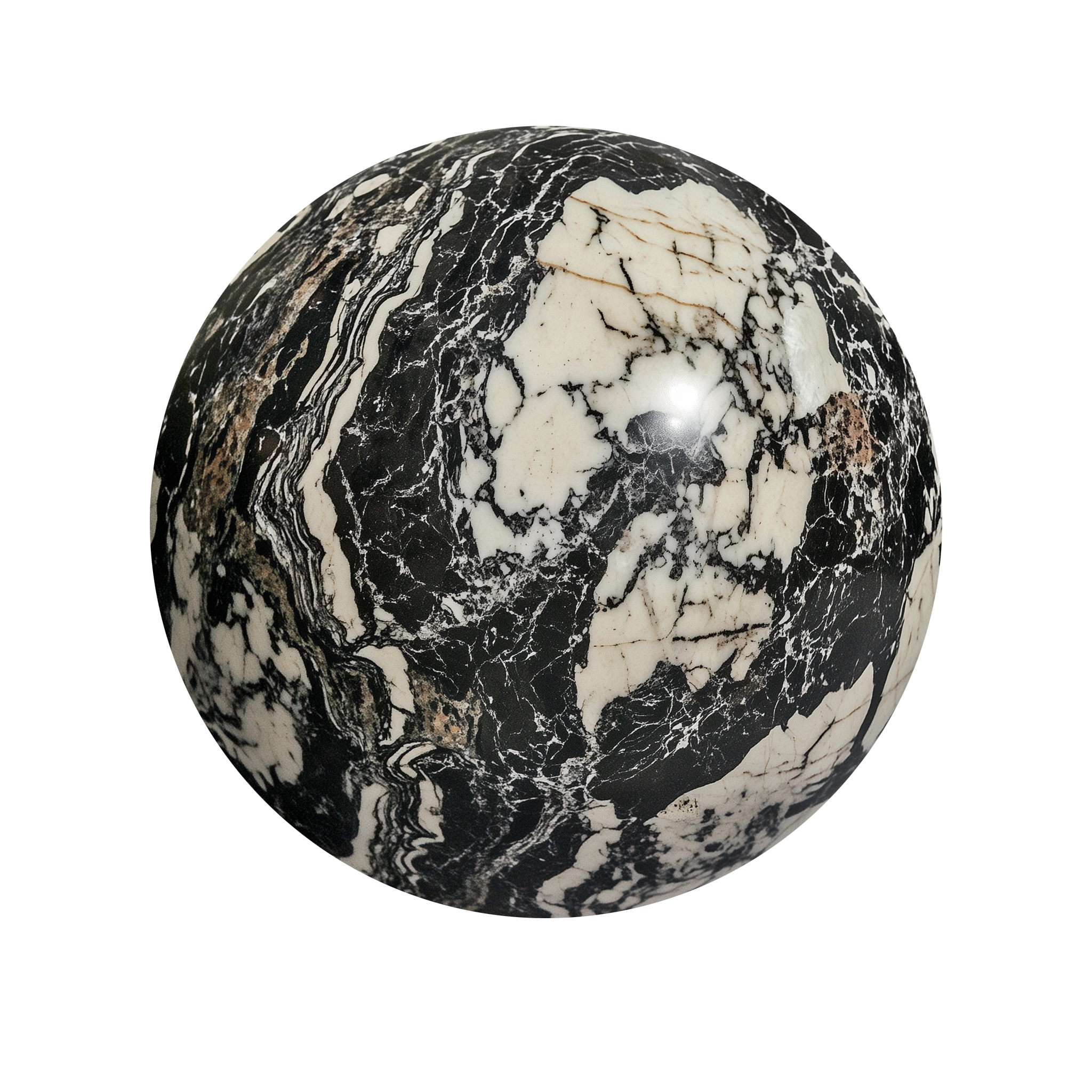
Steinelemente
Sollte ich eines Tages einen eigenen Space haben, stelle ich es mir mit hellbeigen Marmortischen vor, kombiniert mit Stühlen und Akzenten aus Chrom. Die sanften Beigetöne schaffen eine feminine, zarte Atmosphäre, während der Stein Stärke und Authentizität ausstrahlt. Ein Raum, der gleichermaßen elegant wie geerdet wirkt – und so alles in Balance bringt.
AIRE Logo
Das Design von AIRE ist die perfekte Darstellung der Welt, mit der ich arbeite – subtil, unsichtbar. Genau das wollte ich visuell vermitteln.